How To Buy A Domain Name For Your Website

How To Buy A Domain Name For Your Website

The domain name, or home, for your business is a critical point for your company’s visibility. If customers can’t easily find your online presence, they’re unlikely to search for long, and may well find a competitor of yours instead.

Domain names are a big market, and prices range from several pence to thousands of pounds depending on the terms used. Your domain name should be relevant, easy and intuitive. Here we show you how to buy a domain name for your website.

What is a Domain Name?

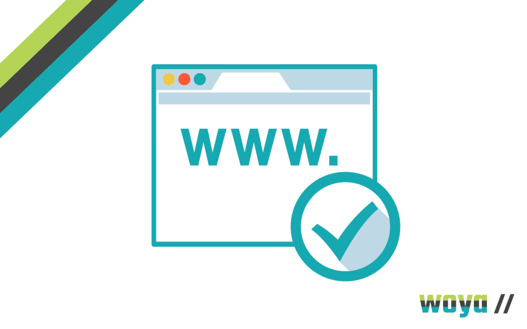
Put simply, a domain name is the address of your website on the internet. Beginning with www. (an abbreviation for world wide web) and ending in a range of suffixes (the most common being .com, .co.uk, .net and .org), it is usually just your company’s name.

A domain name links through to your website, so when it’s typed into an internet browser or clicked through to, it directs to your business website. Your website doesn’t actually ‘live’ here as such, but it’s how it will be found.

How Do I choose a Domain Name?

Normally, a domain name will be your business name. However, if for any reason this isn’t available, you may wish to pop in hyphens, shorten or abbreviate it or go for something else entirely. For example, if your company is a mechanics based in Sheffield, sheffieldmechanics dot com may suit you rather than your business name.

Your website can have as many domain names as you like, although you should only communicate one for consistency. Other domain names may be in place to help potential customers swerve competitors or just to capitalise on random searches.

How Do I Find Out Which Domain Names are Available?

Search! Domain name companies will be able to list out variations of your chosen name for you to select from. You may still be able to buy names directly from the owner, but this is often an expensive way to purchase and ideally, should be avoided.

Are Domain Name Prices Set?

Absolutely not! Domain name companies often host sales and different offers, so it makes sense to shop around. As with any purchase, you’ll find different price points and different levels of service from different providers, so only settle for someone that you feel works for you and your business.

Most domain names can be bought from more than one provider, so there’s no need to find the name you want and buy it immediately without checking others.

How to Buy a Domain Name for Your Website

Different domain name companies will have different processes, but in most cases, you’ll need to select your domain name and/or service package, make a card payment, and it’ll be yours immediately. Once allocated to you, you can assign the domain name to direct to your business website and it will be ready to use within 24-hours.

Domain name purchases are usually valid for a year, so unless subscribing for longer, you will need to re-purchase thereafter.

For information and support with regards to getting your new business website up and running get in touch with the Woya Digital team and find out all about our pay monthly website support packages.

5 Top Small Business Website Tips

5 Top Small Business Website Tips

If you are a small business or start-up, one of the most powerful tools in your marketing armoury is your business website. This mainstay of your online presence is the destination of all your digital marketing engagement and without it, you can’t hope to make more sales, get more clients or convince customers you’re the company to do business with.

The key to a successful website is not only the graphics and slick design (though these are important, of course). It’s the UX. This stands for User Experience and has become increasingly important as our digital technology has developed. What it means is actually giving your customer all the opportunity possible to engage effectively and easily with your business at all times.

Most people will be accessing your website on their mobile phones rather than a traditional desktop. If you do not have a mobile-friendly website that shows up clearly on a smartphone, you’re likely to lose out because people will become frustrated and search elsewhere.

With this in mind, here are our 5 top tips for improving your small business website so that it works most effectively for your customers, and for your business:

1. Click to Call Phone Number

Potential customers may want to call you directly. The last thing they want is to have to remember your number in order to key it into their mobile.

Your phone number must be clearly displayed on your website and must be a click to call link that automatically dials your business. This is quite a simple point, however you won’t believe how many business websites we come across that do not have this functionality!

2. Boost Your Mobile Business Website Speed

Many things can slow down your website. The truth is that Google and other search engines are likely to penalise your rankings if your website is taking too long to materialise in front of customers. If you’re not sure how fast your website is, you can use Google’s website speed tester to check things out.

We’re far more impatient when it comes to download speeds nowadays. If we don’t get a response in a few seconds, we’re likely to click away. Our advice is don’t risk losing customers because of slow mobile download speeds, find out what the problem is and fix it asap.

3. Link to Social Media Platforms

Want your visitors to share your content on their social media platforms or follow your social media accounts?

It’s amazing the number of businesses that don’t have sharing tools and their social media links highlighted on their website. And those that do, often hide these away at the bottom of pages. Make them front and centre to ensure more engagement!

4. Invest in a Business Website Chatbot

There are lots of benefits to using chatbots, AI software that can do the heavy lifting when it comes to the standard questions people often ask about your business. Not only does it give customers answers they are looking for immediately, it greatly improves UX (It doesn’t have to be expensive either!)

5. Claim your Google Business Profile

Google offers a range of different services aimed predominantly at local small businesses. Claiming your business profile means that your location and business information appears on searches. Having accurate profile information, and by adding products and services, you can get additional promotion and visibility online.

Making the most of your website is vitally important if you are a small business. These simple tips will improve the user experience, help promote better engagement, and boost your business growth.

If you would like to find out what else you can do to supercharge you small business website, why not take advantage of our Instant FREE SEO Site Audit and we’ll send you a report to highlight all the things that can be improved on your website!

Why Your Mobile Website Needs to be Mobile Friendly

Why Your Mobile Website Needs to be Mobile Friendly

Gone are the days where all web traffic was received as a result of a user browsing on a desktop computer. Today, mobile devices (excluding tablets) are responsible for over 58% of all internet traffic, according to Statista. It’s now very much the norm for web users to access online content on their smartphone, and for many, they don’t need a bigger device for their needs.

However, we’ve all had the experience of accessing a website from a mobile or smaller device and finding that it isn’t mobile friendly, so doesn’t display or load properly. It’s frustrating, and in most cases, a user will just exit the site and  find an alternative site to meet their needs.

This is why being mobile friendly is critical to a business’ success – because if it’s not managed properly, 58% of the audience online will head off to their competitors.

Traffic Levels from Mobile Devices

There are more than 5 billion internet users around the world, which equates to over 63% of the entire global population. Of this, some 4.7 billion (59% of the population) are social media users.

The fast adoption of mobile devices and smartphones globally has transformed the public’s internet browsing habits. Traffic from mobile devices (excluding tablets) has accounted for 50% of overall traffic since 2017 but has surpassed that figure consistently since 2020 – and looks set only to rise further.

Google and Ipsos found in a 2019 survey that 50% of smartphone users admitted they were more likely to use a company or brand’s mobile friendly website to shop from than an app, because they felt downloading one was an additional step they didn’t need or want to take. That said, web traffic can come direct or through an app – depending on what’s suited best to the business. According to Top Design Firms, 32% of small businesses already have a brand-specific mobile app developed and 42% plan to build one in the future.

The evidence is clear: businesses need to at least have a mobile responsive website in order to create a fantastic UX and encourage conversions.

Mobile Responsiveness

A website built with mobile friendly design will detect the device data of a user when they visit and present a format that fits the screen size, loads correctly and has the relevant security protocol in place. You’ll likely have seen a mobile friendly website in action – noticing that the photos and content are formatted in a more streamline manner when you visit the site on a mobile device compared to on a laptop or desktop PC.

When websites were first being created as a digital marketing tool, they were all built with a set screen width; to cater for visits from a desktop computer. However, now, there are generally four screen sizes focused on with mobile friendly design: desktop monitors (as before, although sometimes bigger), smaller desktop monitors (ie. laptop screens), tablets (ie. iPads) and mobile phones (ie. iPhones).

Most recent responsive design practices allow for almost all of the page elements to be flexible – so they shift to fit but also so that unnecessary images or elements are hidden. Overall, this provides a better UX (User Experience) and allows for the optimisation of conversions or other call to actions on-site from users.

Behind-the-scenes on the site, the same HTML code is sent to all devices and then additional CSS code alters the page rendering to fit the device from which its being visited.

SEO Impact of Mobile Responsiveness

When businesses think of SEO, there tends to be a natural focus on keyword usage; and while this is an important part of digital marketing, it is no longer the ‘be all and end all’. Instead, Google’s most recent algorithm updates have drawn away focus from curated content creation and instead focus on UX (User Experience). This means that factors in a website’s usability are now key to its organic search ranking.

Google’s algorithm automatically detects the HTML with interchangeable CSS code that indicates mobile responsiveness and favours such websites in its SEO rankings. Having a mobile friendly website can also help Google crawl your site quicker, as a user agent only needs to crawl it once rather than several times to retrieve all different versions of the content.

This allows for enhanced crawling efficiency to allow for faster and more regular fresh indexing. Several on-page factors linked to mobile responsiveness also contribute toward a website’s SEO; including loading time and site security certificates.

It is now near impossible to reach a high-ranking position on Google without having a mobile responsive website and so it’s imperative that businesses invest in a thorough all-round SEO strategy in order to cover off all bases to give the highest possible chance of ranking on page one.

Where there are two websites with similar content in the same niche, Google will always rank one that is mobile friendly and loads quickly above one that does not.

How To Make A Start On Mobile Responsive Web Design

A common pitfall that businesses fall into is buying a web design package that’s one-size-fits-all and doesn’t necessarily work to the organisation’s idiosyncrasies. It is critical that businesses select web design that works best for them and their audience, in order to best present the content and layout that’s most likely to encourage conversion.

Woya Digital includes mobile friendly and bespoke creative design as standard, alongside speedy hosting for the quickest possible loading times. We understand the need to be up, running and optimised fast, so our expert team can turn around an initial design for you in just a few days. Get in touch to talk through our options and make your brand stand out online!