New website launch aimed at South American Adventurers by Woya

New website launch aimed at South American Adventurers by Woya

Some projects are more exciting than others, so when we were approached by a Chichester business looking for website design to support a project in Bolivia, South America, we were excited to know more. Even better was that the business actively supports the well known and award winning local vision charity ANDEAN MEDICAL MISSION (AMM).

One of the more difficult elements of most web design projects is getting quality content and imagery. However vAMMos and AMM have been on charity expeditions and trips to Bolivia for many years, so we had more than enough fantastic text, images and even video content to fill the website many times over.

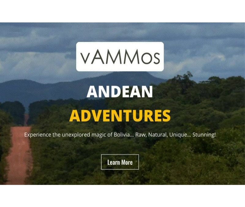
vAMMos provides English speaking bespoke adventure tours in Bolivia, South America, exploring the towering snow capped Andean mountains or the winding rivers of the Bolivian Amazon. Over the last 6 years Dave and his team have been providing the logistics and support to safely position surgical teams into remote locations to carry out amazing sight restoration work in the Bolivian Amazon. Their contacts and knowledge, combined with British standards, make planning an adventure of a lifetime a safe and enjoyable experience. They provide a strong warning to adventurers that they don’t offer package holidays.

  • “We don’t do package holidays, but we do like working with guests who want to do something for the first time. How many people have walked the length of a river from start to finish? Do you want to make a trek that hasn’t been done before? Cycle or climb a hidden mountain or swim in secret rivers and lakes. Are you raising money for your favourite charity or finding the real you? Talk to us about it. We love adventure!”

Chichester business looking for website design

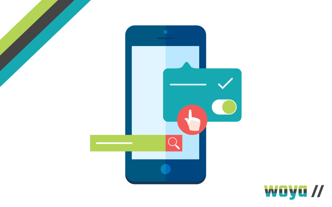
One critical area for this website design project was ensuring that the website was fully visible and speedy as a mobile website. The concept of working in poor signal areas such as Bolivia made this more essential than normal. With over 70% of website visitors and views coming via a mobile phone.

We know vAMMos is delighted with the end results following this kind review on Google:

  • “We loved working with the team at Woya Digital. Very professional and they built us a website just as we wanted. We spent lots of time discussing ideas and we made many changes in order to get it just right. I couldn’t be happier with the end result. Great value as well. I went with a monthly option where they do all the updates for me and I can get on with running my tours whilst they promote the site for me. Definitely call them.”

If you are a Chichester business looking for website design, Woya Digital could be just the solution with an effective business website. Simply call us or even schedule a call at a convenient time to suit you.

About the Andean Medical Mission
vAMMos supports the work of the Andean Medical Mission (AMM) in their efforts to eliminate avoidable blindness in Northern Bolivia. The amazing surgeons and support teams travel every year to remote villages where they carry out sight saving operations free of charge, for the many blind people living in the Amazon. Let’s speak about fundraising for AMM.

Why Your Mobile Website Needs to be Mobile Friendly

Why Your Mobile Website Needs to be Mobile Friendly

Gone are the days where all web traffic was received as a result of a user browsing on a desktop computer. Today, mobile devices (excluding tablets) are responsible for over 58% of all internet traffic, according to Statista. It’s now very much the norm for web users to access online content on their smartphone, and for many, they don’t need a bigger device for their needs.

However, we’ve all had the experience of accessing a website from a mobile or smaller device and finding that it isn’t mobile friendly, so doesn’t display or load properly. It’s frustrating, and in most cases, a user will just exit the site and  find an alternative site to meet their needs.

This is why being mobile friendly is critical to a business’ success – because if it’s not managed properly, 58% of the audience online will head off to their competitors.

Traffic Levels from Mobile Devices

There are more than 5 billion internet users around the world, which equates to over 63% of the entire global population. Of this, some 4.7 billion (59% of the population) are social media users.

The fast adoption of mobile devices and smartphones globally has transformed the public’s internet browsing habits. Traffic from mobile devices (excluding tablets) has accounted for 50% of overall traffic since 2017 but has surpassed that figure consistently since 2020 – and looks set only to rise further.

Google and Ipsos found in a 2019 survey that 50% of smartphone users admitted they were more likely to use a company or brand’s mobile friendly website to shop from than an app, because they felt downloading one was an additional step they didn’t need or want to take. That said, web traffic can come direct or through an app – depending on what’s suited best to the business. According to Top Design Firms, 32% of small businesses already have a brand-specific mobile app developed and 42% plan to build one in the future.

The evidence is clear: businesses need to at least have a mobile responsive website in order to create a fantastic UX and encourage conversions.

Mobile Responsiveness

A website built with mobile friendly design will detect the device data of a user when they visit and present a format that fits the screen size, loads correctly and has the relevant security protocol in place. You’ll likely have seen a mobile friendly website in action – noticing that the photos and content are formatted in a more streamline manner when you visit the site on a mobile device compared to on a laptop or desktop PC.

When websites were first being created as a digital marketing tool, they were all built with a set screen width; to cater for visits from a desktop computer. However, now, there are generally four screen sizes focused on with mobile friendly design: desktop monitors (as before, although sometimes bigger), smaller desktop monitors (ie. laptop screens), tablets (ie. iPads) and mobile phones (ie. iPhones).

Most recent responsive design practices allow for almost all of the page elements to be flexible – so they shift to fit but also so that unnecessary images or elements are hidden. Overall, this provides a better UX (User Experience) and allows for the optimisation of conversions or other call to actions on-site from users.

Behind-the-scenes on the site, the same HTML code is sent to all devices and then additional CSS code alters the page rendering to fit the device from which its being visited.

SEO Impact of Mobile Responsiveness

When businesses think of SEO, there tends to be a natural focus on keyword usage; and while this is an important part of digital marketing, it is no longer the ‘be all and end all’. Instead, Google’s most recent algorithm updates have drawn away focus from curated content creation and instead focus on UX (User Experience). This means that factors in a website’s usability are now key to its organic search ranking.

Google’s algorithm automatically detects the HTML with interchangeable CSS code that indicates mobile responsiveness and favours such websites in its SEO rankings. Having a mobile friendly website can also help Google crawl your site quicker, as a user agent only needs to crawl it once rather than several times to retrieve all different versions of the content.

This allows for enhanced crawling efficiency to allow for faster and more regular fresh indexing. Several on-page factors linked to mobile responsiveness also contribute toward a website’s SEO; including loading time and site security certificates.

It is now near impossible to reach a high-ranking position on Google without having a mobile responsive website and so it’s imperative that businesses invest in a thorough all-round SEO strategy in order to cover off all bases to give the highest possible chance of ranking on page one.

Where there are two websites with similar content in the same niche, Google will always rank one that is mobile friendly and loads quickly above one that does not.

How To Make A Start On Mobile Responsive Web Design

A common pitfall that businesses fall into is buying a web design package that’s one-size-fits-all and doesn’t necessarily work to the organisation’s idiosyncrasies. It is critical that businesses select web design that works best for them and their audience, in order to best present the content and layout that’s most likely to encourage conversion.

Woya Digital includes mobile friendly and bespoke creative design as standard, alongside speedy hosting for the quickest possible loading times. We understand the need to be up, running and optimised fast, so our expert team can turn around an initial design for you in just a few days. Get in touch to talk through our options and make your brand stand out online!